Eike König / Hort
Interview (2021)
I read that you grew up in Germany in the 1970s. Please tell us about your background, including what you were into at that time, and what cultures and people influenced your aesthetic and values.That’s right. I was born 1968 in a small town close to Frankfurt am Main in western Germany. My father was an architect and my mother – at that time - was taking care of us
My first interest in graphic design started while looking at infographics visualizing the arms race that was happening, and the massive amount of weapons of mass destruction. I instantly understood how fucked up the situation was and how easily we can doom this planet. Those little icons spoke to me so intensely that I wanted to know who created them.
Music was my escape, a way to put some light into the darkness of my thoughts. I enjoyed all kinds of music without feeling the need to be part of a specific group. My cousin, who is older than I am, had a very interesting, always growing record collection; and every time I visited him, he opened my ears to new music. Back then, listening to music was also a physical thing. Looking for a record, picking one up, putting it on the record player, lifting the needle, sitting back and looking at the cover while listening. I was fascinated by the artwork early on and wanted to know who designed them. So, I got in contact with the work of Hipgnosis
Another big impact on me growing up was gymnastics. I did serious sport from age three till sixteen. Most of my time was organized around practice and competitions. I learned a lot, like how hard you must exercise to improve, that will is more important than talent, discipline, precision, concentration, balance, tension... but also self-abandonment. I missed a lot of things teenagers my age were experiencing. So, you pay a high price in the end.
What sort of individual perspective do you think being from Germany in that era gave you as a designer?Well, personally it was like a car crashing into a horse-drawn buggy. My education was about worshipping and learning from the heroes from the past... like Otl Aicher, Adrian Frutiger, Joseph Müller-Brockmann, Max Bill etc. I like what they have done, and I also understand my own path through history coming from the Bauhaus movement... but I was more interested in contemporary graphic design. Like David Carson
You became art director at the techno label Logic Records while still at university, and since founding Hort you’ve also produced a number of great music-related graphics. What do you strive for when expressing something invisible like music through design?Not easy to answer, to be honest. Most designers I admired at that time had developed a specific style that also became their visual signature. I love the way Hipgnosis used photography to give music a face... often surreal but also beautifully staged and often strikingly simple. For me they were amazing visual storytellers. The Dark Side of The Moon is an epic moment in its simplicity and beauty, not just for graphic design lovers — it touches a whole generation and it’s an amazing image for the album/music itself. Also Reid Miles didn’t only create record sleeves but the visual identity of a label, and maybe even a genre.
When I was art director at Logic Records, techno was a brand-new genre without a visual face at that time. I used this situation to develop myself as a designer by NOT working on one style but always coming up with new visual explorations. That way I could learn much more. It was also more fun sometimes to just do a plain photo concept and the next one pure experimental typography, then a collage or a digital line illustration, and next a high end 3D rendering with Silver Haze in Softimage... it was kind of a playground for me. Sure, there was always an idea that added another layer to the music I designed for, but the audience was growing with me and did not expect something they learned before in order to recognize this music genre. There were no restrictions and that gave me a lot of freedom. So what do I strive for? For this tiny little thing named ‘your attention’ without it being just very short and instantly forgotten like lightning.
It’s been 27 years since you founded your studio Hort. Do you have any attitude or philosophies as a designer that have remained unchanged from the outset?I was 26... still very close to being a teenager and not ready to let it go. I was naive and hungry, but also a rebel without a cause. When I started my studio I wrote down eight important things I would like to keep in mind. Like I said, they sound very naive, but in a way I still check in on them from time to time, to adjust and maybe make some amendments if necessary. But besides this, I learned a lot on the job, and working with amazing talented people helped me to shape an attitude to design.
Please share with us all eight of those important things.
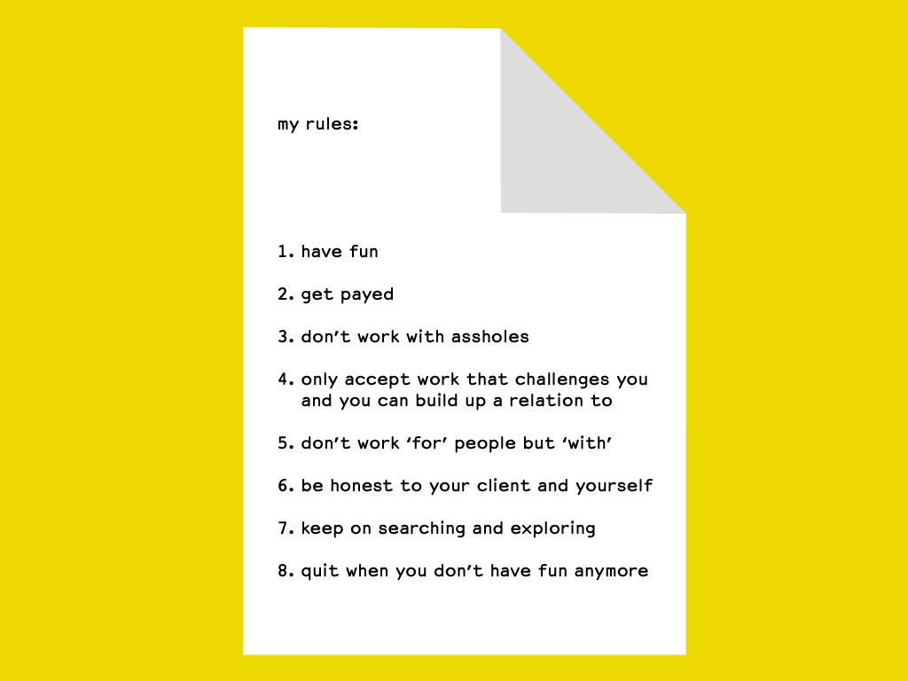
Here are my ‘rules’, but this is how I wrote it back when I started. Enjoying what you are doing might be better than Have fun.
How do you see your own history when you look back at your work?University and especially my teachers really made me very insecure about my ability to design something relevant and good — whatever that means. I had to work hard on myself to gain some self-confidence, and to develop a voice and an attitude I can stand behind. The people at Logic Records really made me feel meaningful and ‘creative’ but I hate that word. It sounds like there are creative people and non-creative people. Creativity is not just visual, it is how you deal with a problem. This branding of CREATIVITY is just a way to charge more money and to feel better.
What has been gained and what has been lost with the development of technology and media?Wow. This is a big question, especially if you try to answer it in a societal way. Technology always solves a problem
But, technology is also a driving moment for new ideas and possibilities. I love technology but I am also aware of the negative impact it can have on us. When I started working with a computer, I instantly fell in love. But I am also very lucky that I learned to design by hand. So nowadays I combine both, use the computer where needed and add the hand if I want to have a different output.
What is demanded of graphic design always changes slightly due to the background or the trends of the time. But what is the attraction to graphic design that remains the same for every generation?Graphic design is a very powerful visual language. Design has a huge impact on our daily life. We interact with it permanently and it influences our habits and needs. It can create dependency, especially on digital devices, so it comes with a responsibility. Maybe people love to have control of such a powerful tool/capability? It can’t be money, ‘cause it’s not really paid well. But to be honest, graphic design is mostly just a service that is used to drive capitalism.
What is your understanding of Graphic Design to you?My girlfriend once said to me when I told her, that I was a graphic designer: “so you just make packaging looking good”. Maybe she is right. We tend to take ourselves and our “creativity” too seriously.
Could you tell us about an experience or project that was a turning point for you as a designer?There have been a few big and many, many small situations that shaped me and the studio. It’s hard to choose one but every time we work with someone who trusts in us without wanting something he/she has seen that we have done before... that often opened a new door. Like Philipp Oswalt, the former director of Bauhaus Dessau Foundation, who instructed us to develop a new identity for the foundation, or Michael Spoljaric at Nike Portland who started working with us on LeBron James back in 2006. But there also have been some negative moments that shaped us.
The bold typographic visuals that Hort have created for clients such as Nike are not only impactful, but also rich in storytelling. Aside from conveying the meanings of words, what sort of role do you think typography plays?Typography is the main foundation of graphic design. It works even without any layers of image or color or anything else. It can function as a pure container for information: by including the history of the typeface and bringing it to an actual context you can tell a story. But also the way you set it on the format can push the tone of voice: loud or very shy, dynamic or static, deconstructed, chaotic or organized by grid, intuitive or conceptual... there are so many ways you can design with typography. Maybe that’s why nowadays the real heroes in our field are type designers—they also were the first ones who established a great way to get royalties for their work.
You have been working with typography for many years, both as a designer and as an artist. What is it about typography that keeps you interested in it?I really like to use as little information and as few layers as possible to tell a story. For me, simplicity is a key of communication: I want to include rather than exclude. In the end, we don’t design for designers but I still want to take the chance to educate people in new aesthetics and reading the information behind a design. Comic language is a great example. When it is well set in typography within a story on the page, it’s so powerful and easy to understand for all kinds of people
In my artistic practice, I use Helvetica as a neutral container for all kinds of information I would like to display. I decided against other typefaces as they would bring in their very own story that I don’t want to include. I keep my work open for interpretation. There’s always a very personal thought behind each piece, but for me it is not important that the message is understood in that way. I am more interested in the variety of how you personally would read it.
What are the specific reasons why you create your artwork by hand? Do you think there are certain things that digital techniques cannot describe?I am just tired of sitting in front of the computer, cutting off some of my senses to look into a glowing screen. I was trained to do things with my hands. For me this is a full on experience. There is a specific amount of time programmed into my practice and I cannot force this without losing concentration and precision. So it automatically calms me down. After living a high speed working life for such a long time it feels like a relief and I feel connected with me and my body again. This sounds a bit esoteric :-) but this is how I feel while doing it. And for sure, technology also defines its aesthetics, which you can also hack and break and transform. I still sketch ideas digitally and I also record my thoughts digitally. But the object itself is often done by hand... My latest paintings I name analog renderings. Like in a 3D program, the canvas is a wireframe and all the rest is just a mapping. One layer that looks like the gesture of a painting, one layer that contains the information and another layer that gives it a shining surface. The content I paint on the canvas is just a projection and can be easily exchanged. So I try to paint the typography as perfectly by hand as possible but you can still see it’s done by hand. Little errors that I feel create a connection to us humans.
How would you characterize the identity of your own work as an artist?Shall I use this space now to promote and sell myself as an artist? I have the expertise to do that... but you just need to check my Instagram feed and you can see the identity I created and use to communicate myself as an artist. I am very consistent at it. And my artworks are part of my branding.
How do you embody an idea as an artwork to make sure it doesn’t lose its purity?That’s the big question. I don’t know. There’s a lot of doubt involved that can drive you to look at it critically again. For me, in the end it’s often taking away anything that could distract from your idea. May it be a color or even a word in one of my sentences.
You teach at the HfG Offenbach, what do you think is the most important thing to convey to design students?That their work can have a social impact and that they can choose to whom they offer their ideas and skills. But I also want to invite them to share their knowledge, collaborate and take care of each other... even if they might become competitors after uni.
What plans or prospects do you have for the future?My girlfriend and I are planning to build a house together with architects at the moment. A very special house with an attitude. The design is done and the next step will be to start the construction. It’s funny, because it feels like a circle is closing at the moment. My father built the family house when I was three years old. Now, we are building a house and our son is the same age.
At the same time, I work on my artistic practice, trying to find my independent place in the art world. I just opened three exhibitions this autumn and will do another one in New York in March next year. I am very happy about this new path as it brought me back to myself as a driving engine. No client giving me money to develop something to solve his/her problem... just me, with an inner dialog that from time to time needs to become physical and be shared with people. It’s so liberating and fulfilling and it connects my soul with my brain and my body.
And I am looking forward to travelling again after staying in Berlin for nearly two years due to the global pandemic. And I’m looking forward to see our child growing up and becoming independent. And and and...